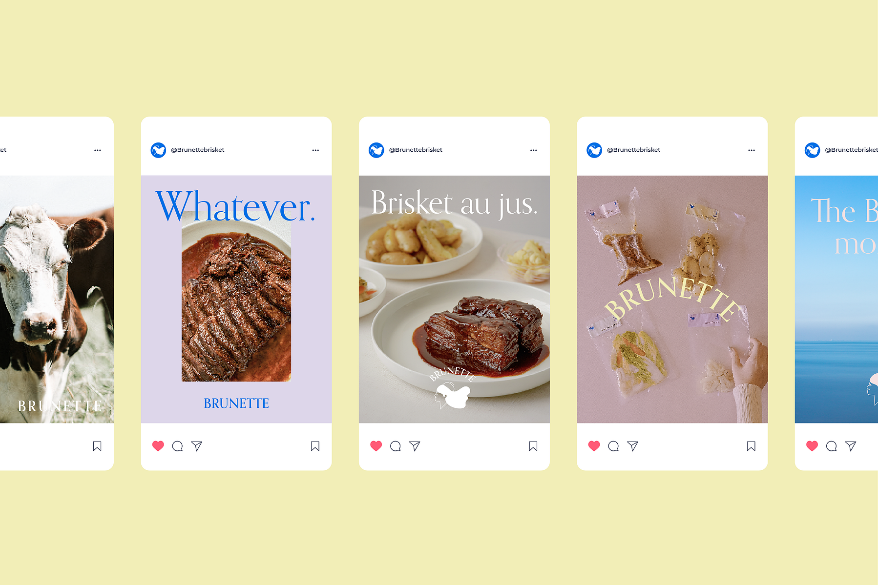
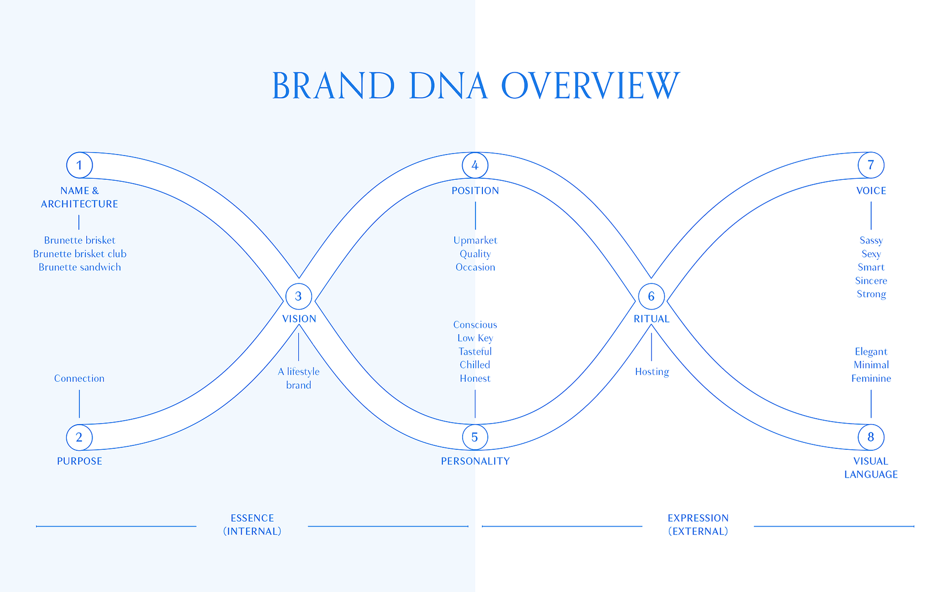
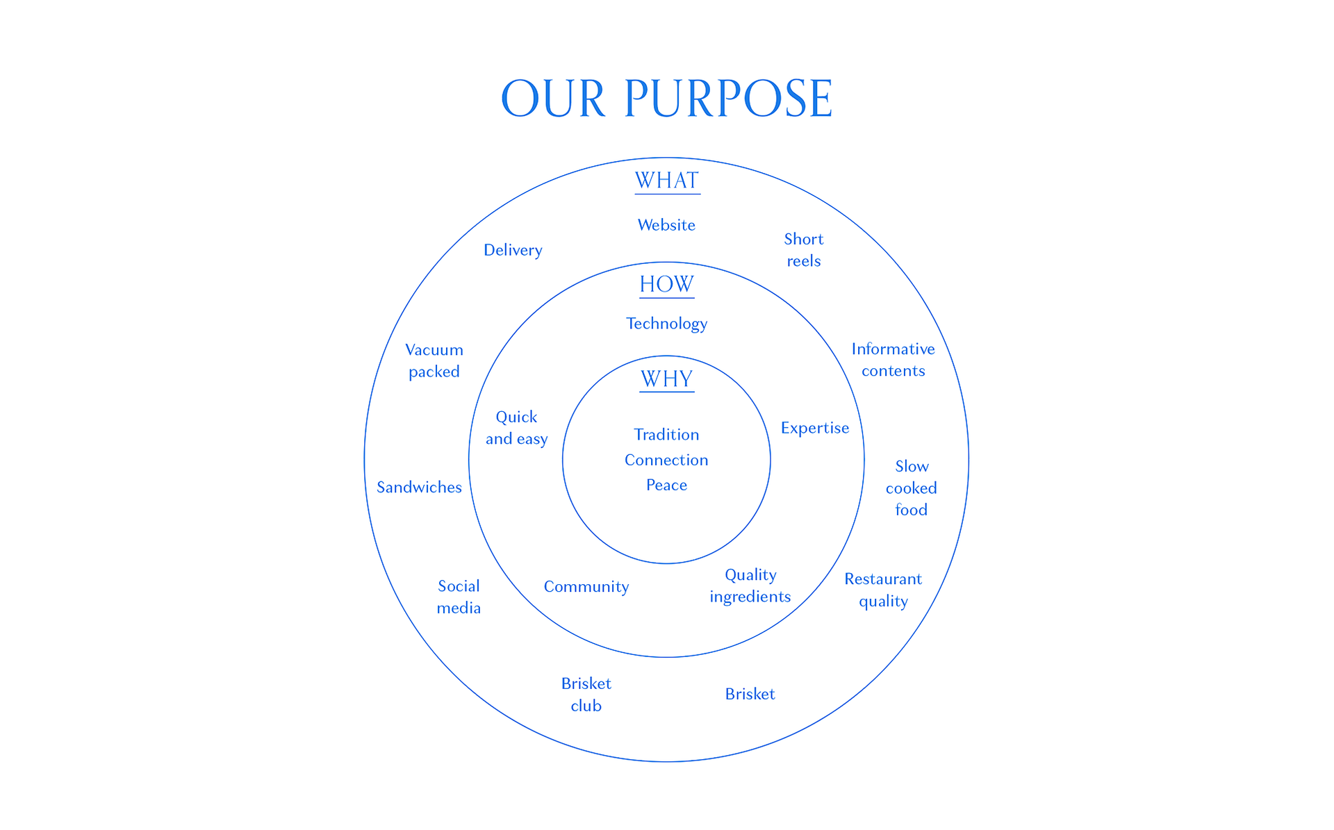
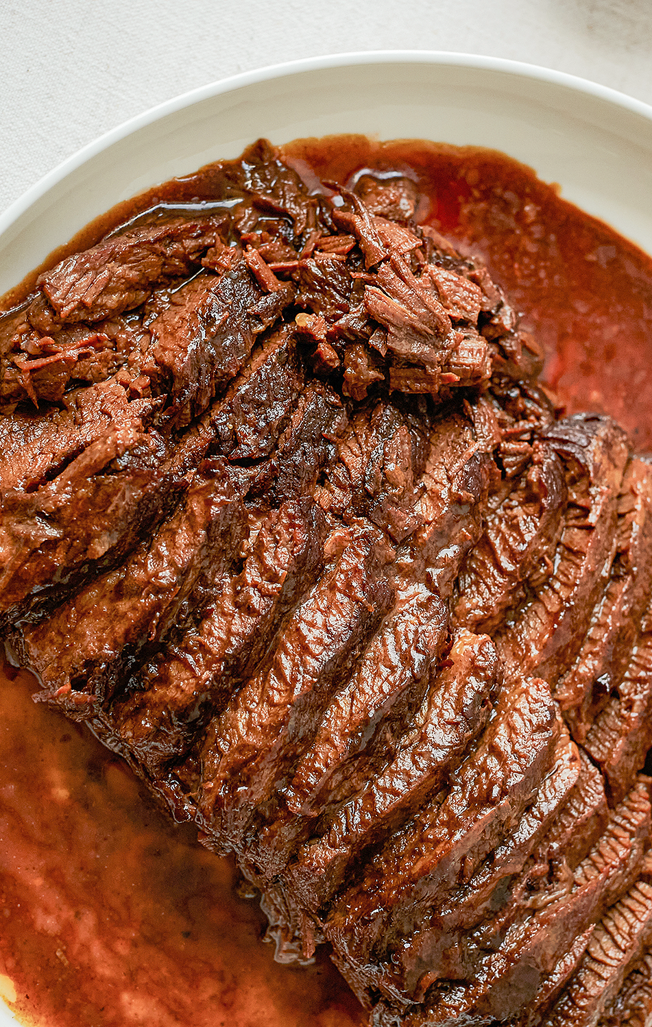
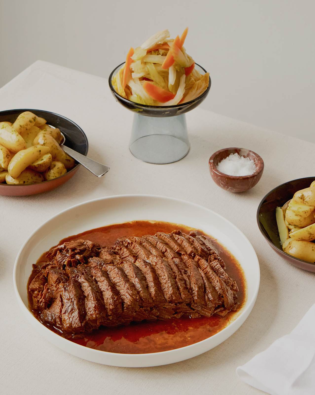
Born in the midst of the pandemic, Brunette sets out to bring people closer by serving gourmet Brisket KITs that people can prepare at home in under just 10 minutes. Its core value is about bridge and connection.

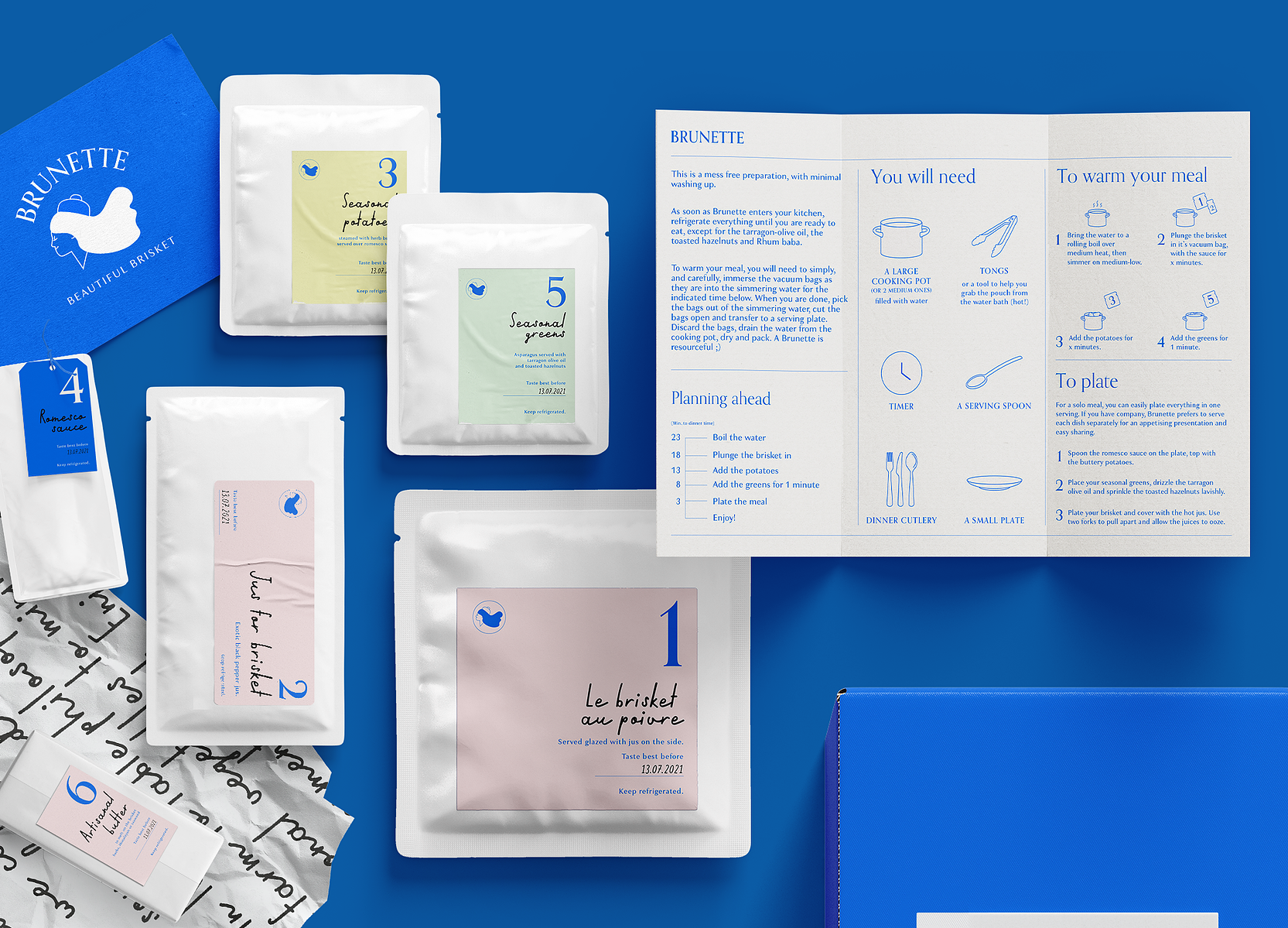
Each ingredient hand picked, each step thoughtfully crafted.
The brand wants to give a twist to the idea of a feast, turning it into something that you can enjoy effortlessly and beautifully, while catching up with our loved ones.
The colour blue is used to symbolise the purity of the environment where our cattles are raised and the simplicity of our menu, whereas the serif typeface represents the craftsmanship in our food.
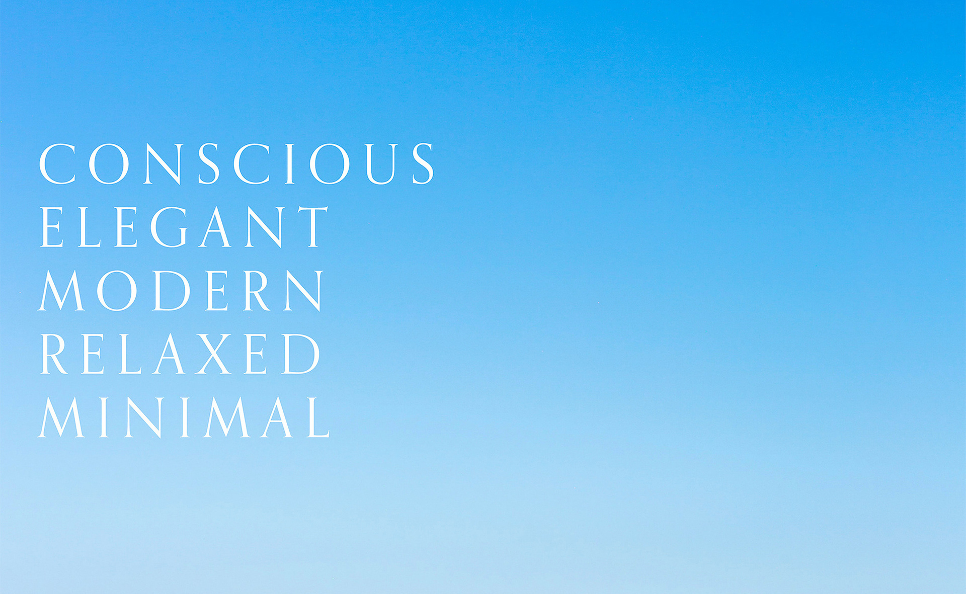
The brand character draws inspiration from the name itself—an imagined brunette: effortlessly stylish, with a discerning taste for modern gourmet cuisine. She represents a quiet sophistication, always composed, yet warmly inviting as she prepares and presents a carefully considered feast.
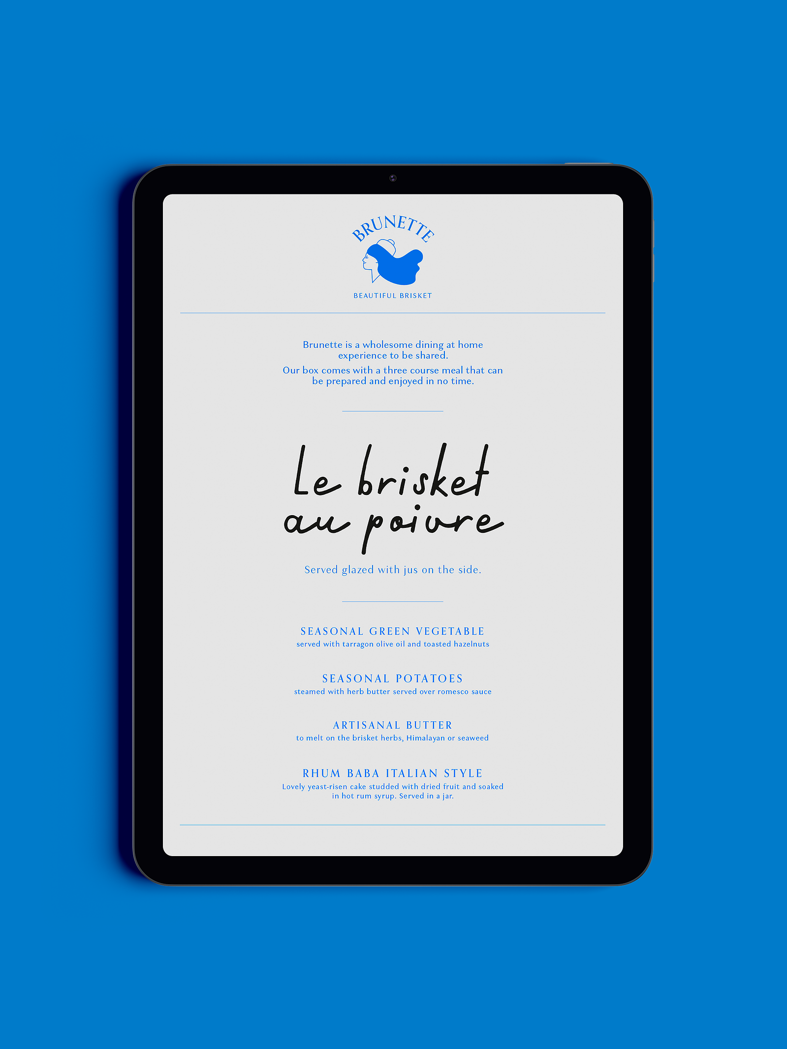
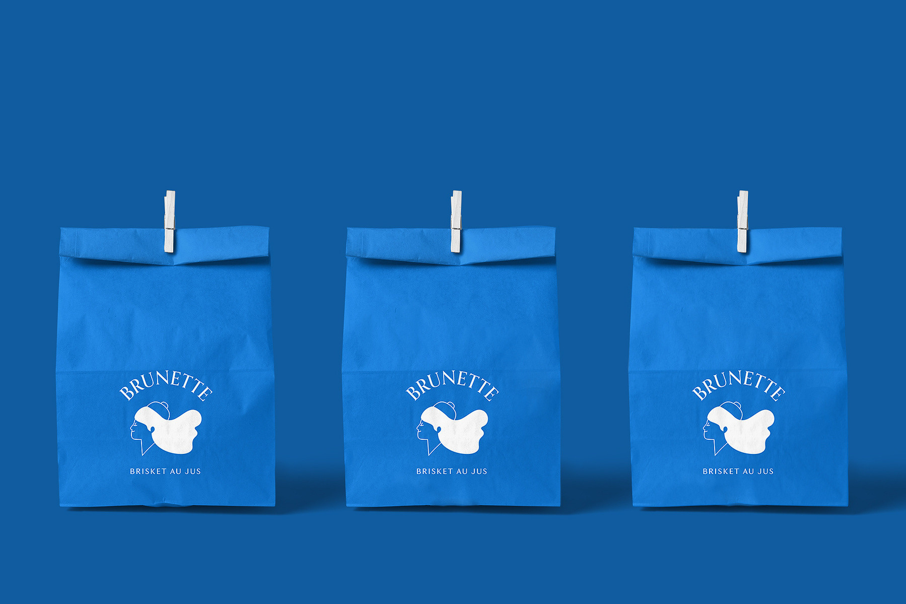
This sense of elegance is carried through to the user experience. Each pouch is thoughtfully designed with a clearly placed label at the top for ease of use. Preparation is made as simple and seamless as possible, with detailed yet intuitive instructions provided. From packaging to practicality, every element has been crafted to ensure that enjoying fine food at home is a pleasure, not a chore.

Product Labels

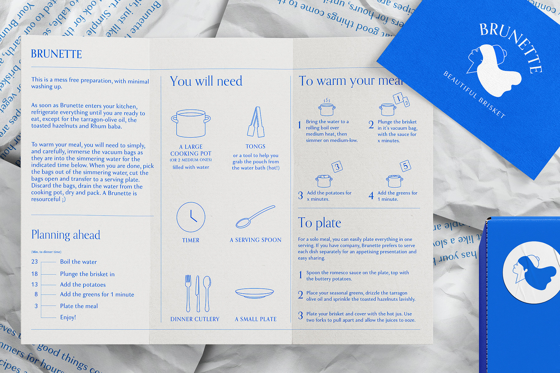
Cooking Instruction

Delivery Box
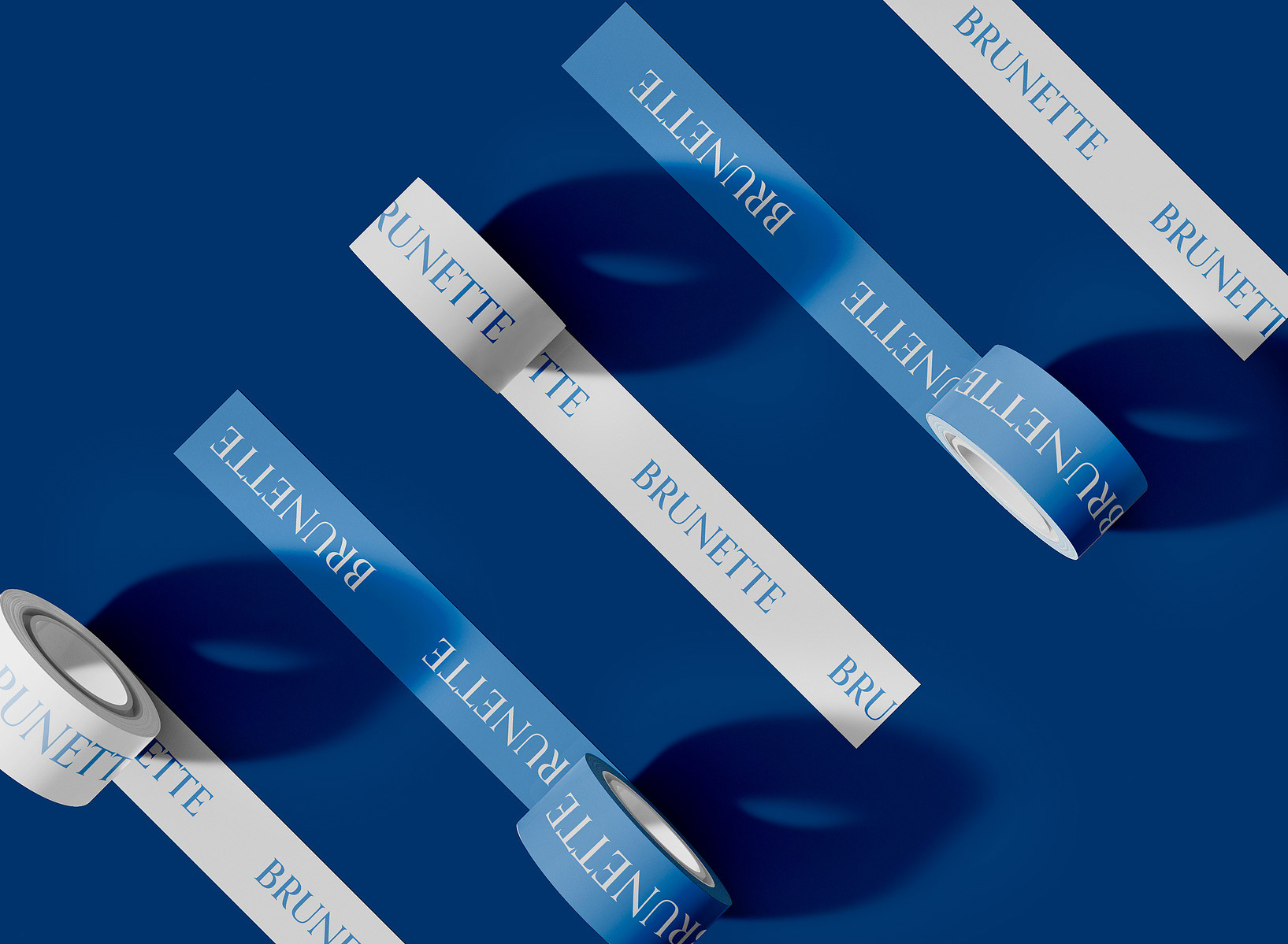
Tapes for the Food Packaging